Realistic Credit Card Mockup: A Practical Guide for Better Design Decisions
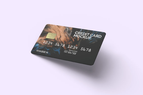
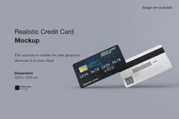
Whether you're launching a fintech app, presenting a new rewards program, or showcasing a financial service on your website, a Realistic Credit Card Mockup helps bring ideas to life—visually, credibly, and professionally. Unlike basic flat templates, these mockups simulate real-world lighting, texture, depth, and perspective: think subtle card tilt, realistic metallic finishes, embossed numbers, and natural shadowing against a desk or hand. That realism builds trust before a single line of code is written.
Why “Realistic” Matters More Than You Think
Many designers grab the first free PSD or Figma file labeled “credit card mockup” without checking how closely it mirrors physical behavior. But here’s the catch: a slightly off-angle shadow, mismatched font weight on the card number, or inconsistent CVV placement can quietly erode credibility—especially with finance-savvy users or stakeholders reviewing your pitch deck. Realism isn’t about perfectionism; it’s about alignment with audience expectations. When your mockup looks like something a bank would actually issue, your concept gains immediate legitimacy.
Common Missteps—and What They Cost You
Most errors aren’t technical failures—they’re oversights rooted in speed, assumptions, or outdated resources. Here’s what trips people up—and why it matters:
- Using outdated card layouts: Some mockups still show magnetic stripes on the back or omit EMV chip positioning. If your design implies legacy tech (e.g., no chip, no contactless symbol), reviewers may question your product’s compliance or modernity—even if your actual solution is fully up-to-date.
- Ignoring regional standards: A U.S.-centric mockup won’t reflect the layout of a UK Maestro card or an Australian Visa Debit card. Using the wrong card type for your target market can confuse localization efforts—or worse, signal a lack of research to international partners.
- Overlooking editable layers: Not all mockups let you easily replace the card number, logo, or expiry date without distorting perspective. If text layers are rasterized or poorly grouped, swapping details becomes time-consuming and risks visual inconsistency across your asset library.
- Assuming “free” means “ready-to-use”: Many free downloads come with missing fonts, locked layers, or low-resolution exports. You might spend 20 minutes troubleshooting a blurry chip graphic—time better spent refining your value proposition.
How These Errors Show Up in Real Work
Consider a freelance designer preparing a pitch for a neobank startup. They use a generic mockup with a misplaced hologram stripe and default “CARDHOLDER NAME” placeholder in all caps—while the client’s actual branding uses sentence case and a custom sans-serif. The result? Stakeholders focus on the visual mismatch instead of the UX flow. Or imagine an educator creating a financial literacy worksheet: a mockup showing an incorrect CVV location (e.g., on the front instead of the back) could unintentionally teach learners the wrong detail.
What to Check Before You Download—or Buy
Before adding any Realistic Credit Card Mockup to your project, ask yourself three practical questions:
- Is the perspective consistent with how the card will be used? For mobile app previews, a slight top-down angle works well. For printed brochures, a clean front-facing view with soft shadows reads more clearly. Avoid extreme angles unless they serve a specific storytelling purpose.
- Are key elements customizable without breaking realism? Try replacing the card number, logo, and expiry date in your design tool. Do fonts scale naturally? Does the chip stay aligned? Does the background remain neutral (no distracting textures or watermarks)?
- Does it reflect current industry norms? Look for subtle but important cues: a contactless wave icon near the chip, correct spacing between the card number groups (e.g., 4-4-4-4), and appropriate contrast between foreground text and background color—especially for accessibility.
Better Choices Start With Intentional Selection
You don’t need ten different mockups—you need one that fits your use case *and* scales with your needs. For example:
- If you’re building a responsive dashboard, choose a mockup with layered smart objects (in Photoshop) or auto-layout frames (in Figma) so cards adapt cleanly across device sizes.
- If you’re creating social media assets, prioritize mockups with transparent backgrounds and subtle drop shadows—so they integrate smoothly over brand photography without extra masking.
- If you’re sharing files with non-designers (e.g., marketing or legal teams), opt for formats with clear naming conventions and documentation—like a README file noting which layers control the chip glow or signature panel.
Also worth noting: some creators bundle mockups with matching UI elements—like digital wallet screens, payment confirmation modals, or even NFC tap animations. These aren’t gimmicks; they help maintain visual continuity across touchpoints, reducing the mental load for your audience.
Avoiding the “Too Generic” Trap
One of the quietest pitfalls is using mockups that feel interchangeable with every other fintech presentation. Realism includes nuance—not just accuracy. A premium credit card mockup might include fine-grained texture overlays (brushed metal, matte laminate), while a student debit card version could emphasize rounded corners and vibrant accent colors. Choosing deliberately—based on your audience’s expectations, not just convenience—adds quiet authority to your work.
And remember: realism extends beyond the card itself. Pair your mockup with context. Place it beside a smartphone showing your app interface. Add a coffee stain on the table surface in your hero image. These small humanizing details don’t distract—they deepen relatability.
Final Thought: It’s About Clarity, Not Just Looks
A Realistic Credit Card Mockup isn’t decoration. It’s a communication tool—one that signals attention to detail, respect for user experience, and fluency in financial design language. When chosen thoughtfully, it saves time, strengthens messaging, and supports better decisions across teams. So take those extra two minutes to verify the chip position, test the editable fields, and confirm the layout matches your region’s standards. That small pause pays off every time someone looks at your work and thinks, “Yes—that feels right.”